BROOKLYN
→ A case study for Canva
MANAGEMENT
→ QUESTION:
A project that demonstrates your preferred/personal visual style and showcases your capabilities as a creative designer
→ CLIENT & DELIVERABLES SUMMARY
Client: Brooklyn MGMT
Campaign: Book Talented
Location: Australia
Agency: The Reactor
Role: Creative Lead
→ BUSINESS BRIEF SUMMARY
Get
Who
To
By
Brazen Models…
Is losing market-share, engagement and talent to other competitors…
1) Compete with other talent agencies in the Australian market within a new higher tier.
2) Ditch any old stigma related to their original brand and offerings (IE promo girls).
Renaming, repositioning and rebranding the business in a contemporary way, to:
1) Attract more high-end customers (talent).
2) Create hype and excitement amongst models, clients, associates, PR and the industry.
3) Expand into representing creatives and influencers.
→ CUSTOMER-FACING BRIEF SUMMARY
Get
Who
To
By
People aspire who to be models, actors and influencers…
Are either;
1) Already signed up to Brazen Models, or, are
2) Looking for representation with competitors…
Inspire them to stay with Brooklyn MGMT, or, register with Brooklyn MGMT…
Showing them the agency is investing in rebranding to compete at the next tier in the industry, expand their offerings and opportunities for more inclusive, authentic and diverse representation.
1. STRATEGY →
After a ‘lite version’ of The Reactor’s strategy workshop, followed by a current and future brand strategy report and proposal, the tag line and creative platform for the new brand was built around the words:
BOOK TALENTED.
2. CONCEPTS →
Concept 1

Concept 3
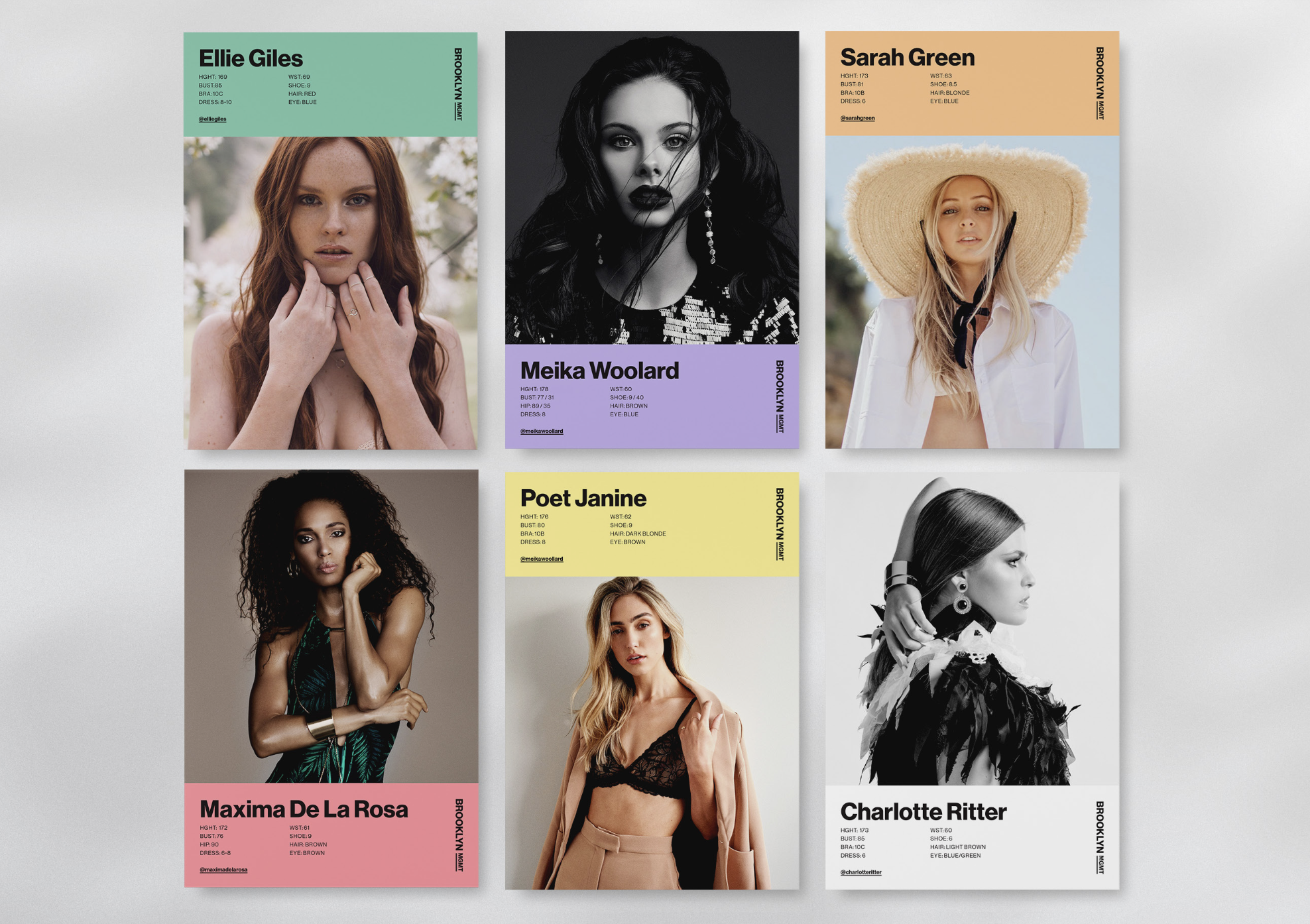
We completed some initial research, competitor analysis, brand discovery and early concepts of logos, and then we were asked by the client to apply 3x logo variations to a group of mocked-up Comp Cards to convey 3x different art direction styles/potential brand treatments.
This helped the client visually see ‘how’ different logos could suit different ‘looks and feels’.

Concept 2
3. DESIGN & CREATIVE DIRECTION →
→ LOGO SUMMARY

The end-result was a minimal and contemporary brand, anchored by impactful typography and a witty tone of voice that complimented any potential geometric layout, without taking the focus off the talent or content.
This clean but dynamic and contemporary approach is definitely reflective of my personal aesthetic/design style. Therefore, closely aligned with what the client wanted (but pushed further ☺).
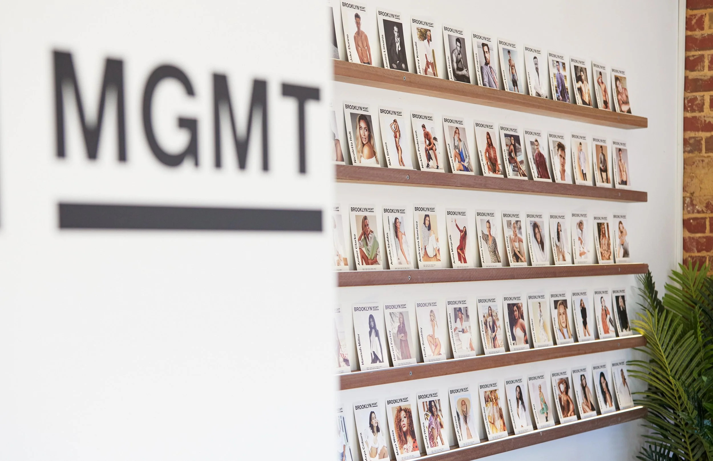
→ VISUAL SUMMARY


→ SIGNAGE & OFFICE SUMMARY


→ TONE OF VOICE
Brooklyn MGMT’s language and brand TOV needed to sound like an agency that offers the professionalism of a big talent agency, without the attitude and price tag which often comes with it… but also rooted in authenticity and realism.
We achieved this through a combination of; light-hearted mockery (‘not all sunshine and rainbows being a model), clever rhetoric (One model. Two castings. Three degrees.), and concise remarks clients and booking agents and producers can relate to (turning heads at 9:15 on a Monday).


→
MAIN DESIGN
CHALLENGES
I had on this project were…
Since this client came to the table with a very contemporary and minimal aesthetic in-mind right from the start, this project helped further develop my understanding of how to approach, educate and manage a client’s expectations from a design standpoint.
I achieved this by accepting their notes and showing them how important it is to take a step back and using those notes to explore and highlight the importance of strategy and concept development to push their ideas further.
These learnings also further influenced my personal design approach; start on paper and start with simplicity!
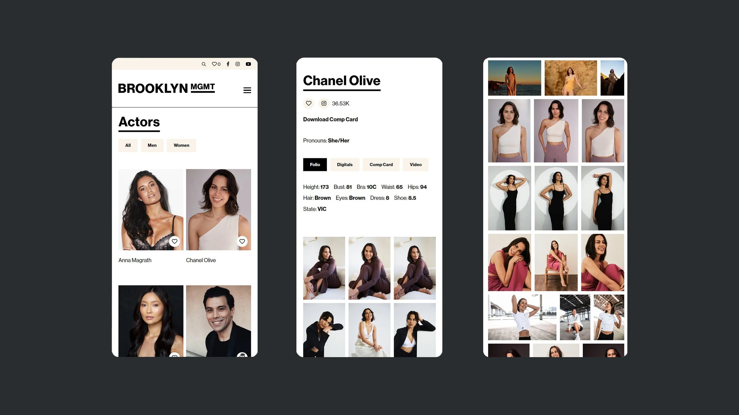
Ironically, thanks to Canva, I also learned a valuable lesson in how to manage and educate clients to ‘design it themselves’, via building brand templates in Canva and empowering them to design, build and use their own (non-complicated) design assets whenever they needed.
This also helped influence our agency’s business model with regards to managing out-of-scope deliverables for other clients at the time, and implement change.
Situation
Tasks
Actions
Results
Learnings
A never ending list of of design deliverables that fell out of scope.
A client that had one dimensional brand, and brand aesthetic in-mind.
Avoiding a super minimal ‘black or white’ brand whilst designing and building a modular design system that was flexible and had room to expand and develop over time, without taking the impact or focus off the talent/content.
Managing client expectations on deliverables and retainer costs.
Convey some creative diversity upon launching the rebrand, whilst giving the client a ‘hint’ into what the future of it could look like.
Expanded upon a neutral colour palette to convey a little diversity of use across printed and digital elements to keep the brand always looking fresh/dynamic.
Taking the client through a linear brand strategy process, concept and development phase, and educating them on the importance of creative exploration.
Built simple templates in Canva to help educate and empower the Brooklyn team on how to use their new design elements and brand in a simple way.
Developed a complimenting suite of colours and supporting geometric/modular layouts to use across assets that didn’t take the focus off the talent/content.
Design system flexibility allowed the brand to always look contemporary without any major visual compromises.
A strong typographic approach complimented the brand personality, TOV and design system in a simple and effective way.
An empowered team that could now design their own brand assets themselves in Canva!

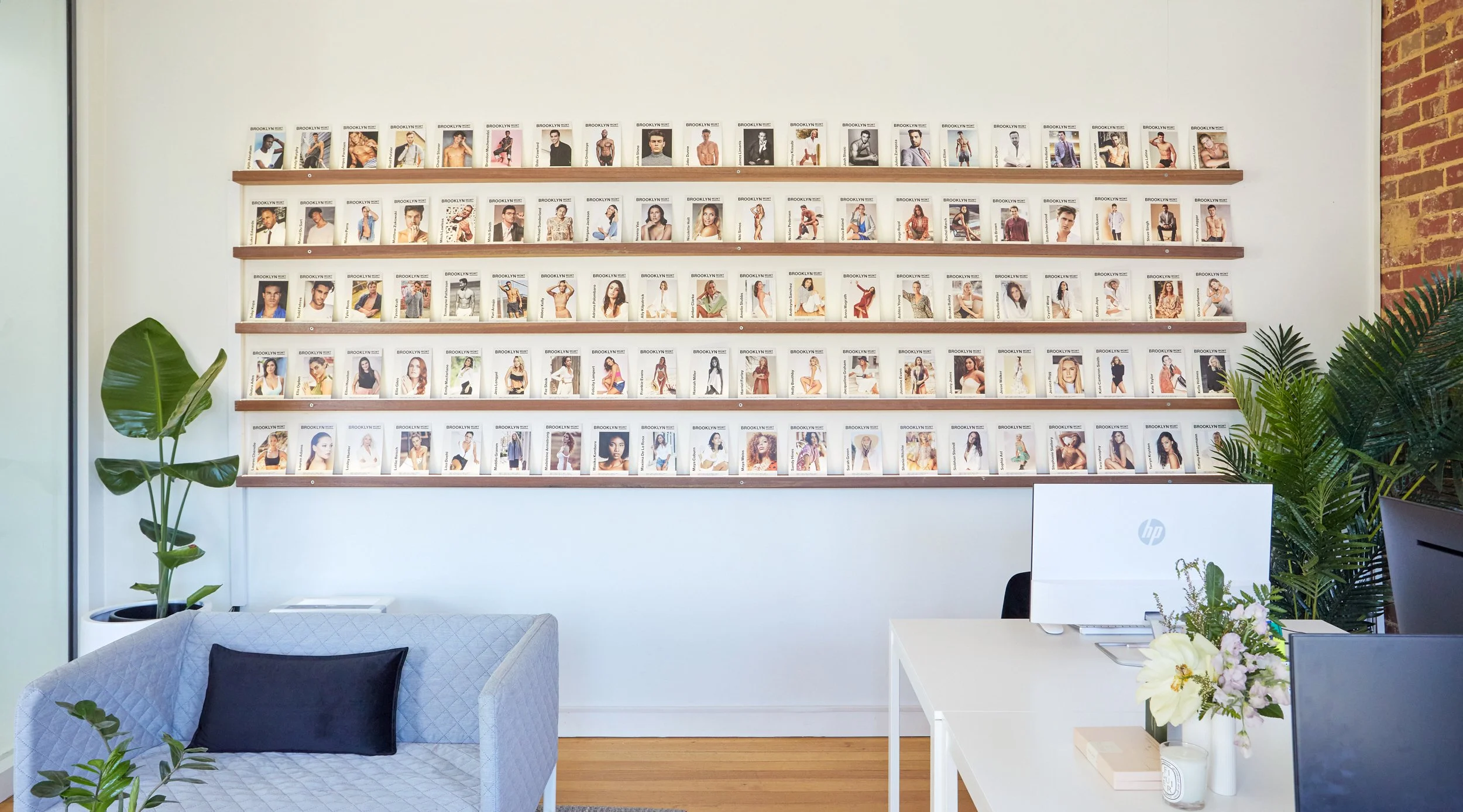
Roughly 30x retouched shots delivered to the client, to use across basically all printed and digital assets for the rebrand, launch campaign and future months.
A combined 12x videos to deliver, cut-up across 3x different aspect ratios for a total of 36x deliverables for video alone.
1x roll of 35mm film BTS shots, taken by myself on the day.
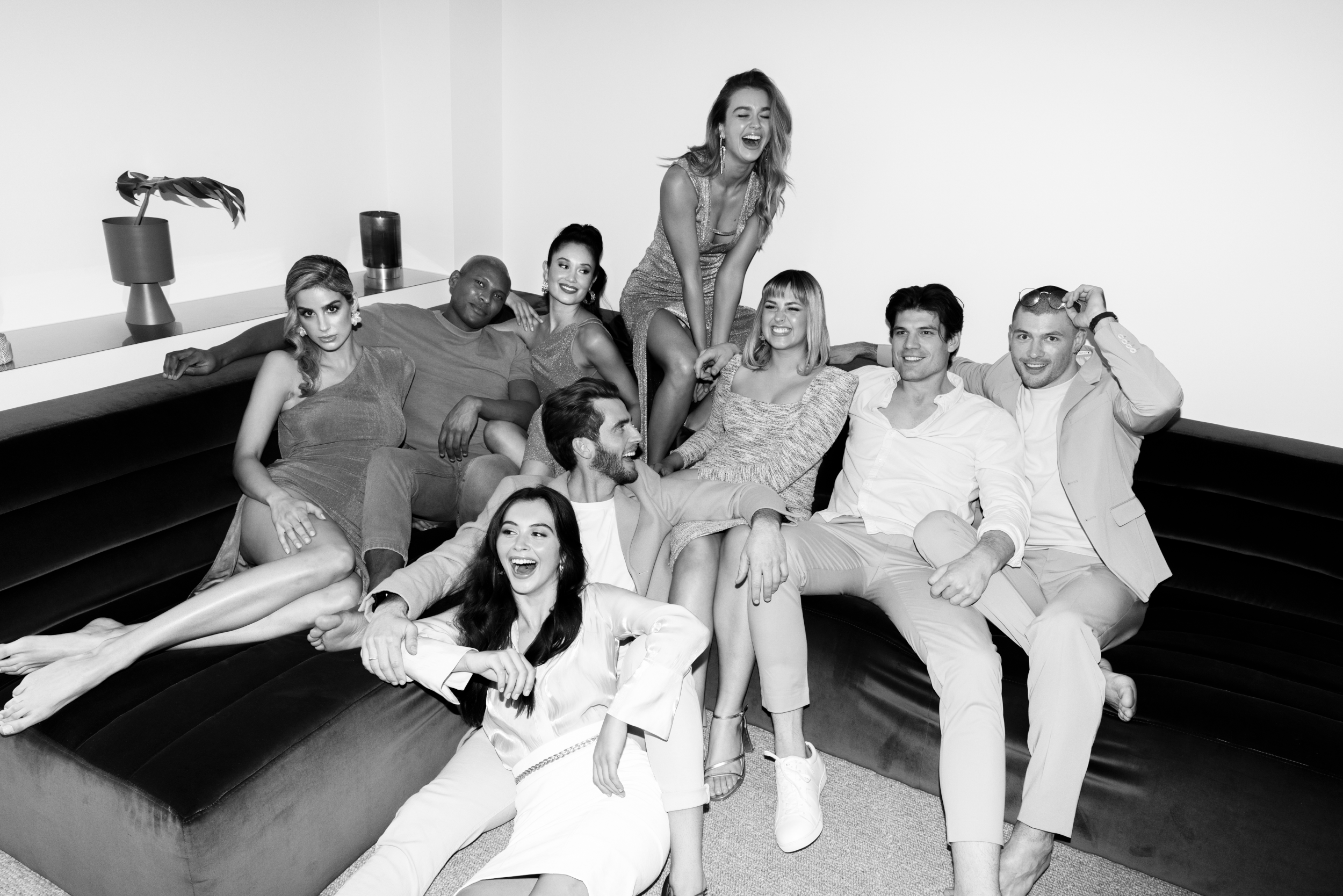
4. PRODUCTION →
The purpose of the content shoot was to convey and capture authenticity, movement, personality and inclusiveness in talent, balanced-out with some traditional modelling-type shots and cut together in post-production.
9x models on a location shoot, each with their own individual shots and hype reels, plus assorted group shots and hype reels.
A total of 23x people on-set to manage and direct on the day.


→
MAIN PRODUCTION
CHALLENGES
I had on this project were…
Through years of shooting experience and problem solving on-set, comes years of working with and managing certain types of people and various personalities. However sexual harassment was a new one for me, but thanks to my diverse management experience over the years, I was proud of how I approached the situation through empathy, and how I handled the situation calmly and professionally.
Through dealing with this challenge, I learned a number of valuable lessons on how to recognise, acknowledge and act on issues surrounding harassment, diversity and inclusion in real-time, specifically within a fast-paced and stressful environment.
Dealing with this challenge highlighted and further added to my abilities as a Creative Lead, but more so as a human being.
Situation
Task
Actions
Results
Learnings
Unprofessional and inappropriate comments from one of the male photographers towards one of the female talent on the day of the shoot.
Was to eliminate this type of comment/advance immediately and ensure it never happens again, ever.
Stopped the ‘shot’ mid shot-break for a reset.
Pulled the photographer to the side for a private chat.
Informed this photographer that these kinds of comments and behaviour are unacceptable and need to stop immediately.
Pulled the model to the side for a private chat.
Informed the model that this type of behaviour should have never happened and apologised if it offended her in any way, shape or form. And reassured her that action would be taken.
Informed my boss.
Swapped shots for the next shot to keep the day moving.
Filled out an ‘incident report’ post-shoot.
Amended generic agency photo/production Ts & Cs moving forward.
Discussed with the client the day after the shoot.
Black listed the photographer post-shoot.
Photographer apologised to myself and the model immediately.
Photographer carried on the day and delivered on the shoot.
Model was extremely professional and accepted the apology with no offence.
We were able to continue on with the day and deliver for the client.
Stills & video content turned out great and the client was happy.
Photographer hasn’t been hired by the agency or client again.
5. REPORTING →
We used simple data reporting and tracking across ads, engagement, sign-ups and impressions that helped the client understand key insights and measure ROI post-launch, as well as planning for the future.
Here are some highlights:
6. Summary →
It was a nice change of pace to have a client that wanted a contemporary and flexible brand, that was (inadvertently) heavily related to my personal design and creative style. IE: modern, minimal but dynamic, engaging through visual impact, strong typography and unique content etc.
The project ended up having had great scope and really challenged my capabilities as a Creative/Design lead.
I was proud of how we collectively challenged the client, and how we went about developing the final brand and design aesthetic which ended up being more than the client wanted and asked for at the start, but loved in the end and has become very successful since inception.