Cover-More Travel Insurance
Client: ExactPath X Cover-More
Type: Freelance
Role: Design lead
Assets: Assorted digital templates and assets
Location: Australia
ExactPath, a customer engagement agency based in Queensland, engaged my services to support their long-standing client, Cover More, with the redesign of their eDM templates, digital animations and various web products as part of an exciting 2024 full brand refresh.
I was responsible for designing and delivering refreshed eDM templates with new animations and assorted website products for both desktop and mobile platforms. Templates were implemented in Salesforce Marketing Cloud by ExactPath, and web assets were built by Cover-More’s front-end developers.
Task:
Choose a past project that demonstrates your ability to convert leads into sales or prompt action (e.g., a landing page, email campaign, product design, or social media ad etc).
Assorted eDM Templates: Newsletter, Campaign & Abandoned Cart
Existing eDM Templates:
Situation:
Cover-More’s eDM templates were outdated and in need of a complete redesign to incorporate the new brand refresh and achieve a modern look.
Task:
The aim was to refresh the eDM templates to create a more engaging customer experience, featuring a dynamic, modern design and brand update that functioned seamlessly across desktop and mobile.
Action:
We redesigned the eDM templates with best design practices and a customer-centric and personalised approach, emphasising key content above the fold on mobile. The visual design was updated to meet UX standards, with a balanced content-focused layout with good visual hierarchy that brought the brand refresh to life in a fun and dynamic way to prompt action. Subtle GIF animations of the new illustrations and countdown timer were added to enhance engagement and bring extra energy to the design.
Results:
Although the update has only been live for a couple of months, Cover-More’s team has reported a steady +3.5% increase in eDM open rates across the board. This improvement has led to significantly more website engagements and conversions, especially when it comes to saving insurance quotes.
Assorted Animations:
Animations:
As part of their brand refresh, the Cover-More team asked us to animate some of their new illustrations and graphic elements for use in their updated eDM templates. The goal was to enhance visual engagement (subtly), and encourage more user interaction, while maintaining a balanced design.
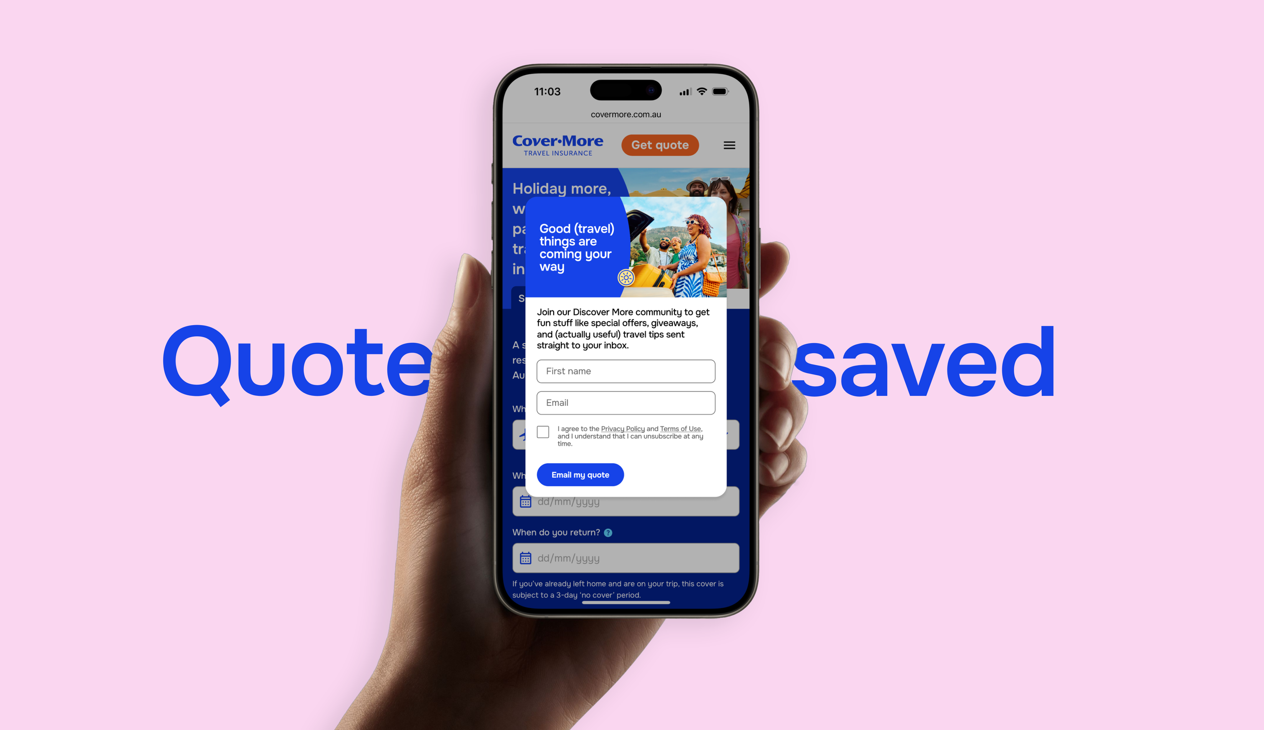
Website Pop-up Banners:
Action:
We designed new pop-up banners with usability and contrast in-mind. The new design now achieves good visual balance, has consistent typographic usage and information hierarchy, all the while prompting quick action for users. The forms in these banners also dynamically change per click-state, allowing for extra functionality.
Results:
Cover-More’s team has reported a further steady +2.9% increase in pop-up banner engagements on desktop, with a +4.2% increase of engagement on mobile. The team saw an increase in ‘saved policy quotes’ staying idol for up to two weeks, then purchased closer to people booking their travel/flights.
Existing Banners:
Situation:
Cover-More’s website pop-up banners were outdated, prompted user fatigue and needed a complete redesign to incorporate the new brand refresh and drive more engagement and action.
Task:
Was to redesign the pop-up banners, incorporating the updated brand refresh to create a more appealing, consistent and engaging experience across desktop and mobile.
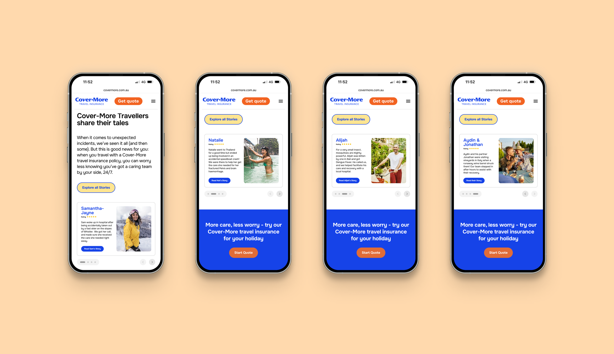
Website Product Carousel:
Existing Content Module:
Situation:
The client used an out-of-the-box module to display their Customer Reviews & Stories that unconsciously promoted user-fatigue and wasn’t over visually engaging.
Task:
We were asked to redesign the Customer Reviews Product Module to visually re-align it to the rest of the website and make it more usable and engaging.
Action:
We designed a new Product Carousel with a balanced 50/50 layout, displaying uniform customer reviews in a clean and simple Product Card format. The updated design aligns better with UX standards, promotes visual consistency, reduces user fatigue, and is more dynamically engaging across both desktop and mobile. A newly combined UI control bar at the bottom features pagination dots and a clear primary action, enhancing user interaction.
Results:
The Product Carousel is currently being built by Cover-More’s in-house developers, and should be ready for A/B testing over the next month. We’re aiming to test with some minor brand design variations against the original module. With the addition of primary and secondary CTAs, we’re also aiming to gauge consumer interest in reading more travel claim stories by introducing a new ‘Customer Stories Summary’ page that users can directly click through to with the hopes of relating to these stories more directly. Adding extra depth to the overall action.


